Design systems
Design System Diagrams: The Four Maps Worth Drawing, Shown With Real Public Systems
Most design system diagrams show everything and answer nothing. Four maps, each tied to one question and built from the public docs and repos of Carbon, Material, Primer and GOV.UK, cover the ground.
· Diagram Studio Editorial
Direct answer
A design system diagram is a drawing that answers one question about the system for one reader. Four maps cover most needs: a token flow map (what changes when a value changes), a component anatomy map (what the parts are called), a package dependency map (what depends on what), and a contribution and release map (who decides, and how a change ships). Draw each from public evidence, not memory.
A design system diagram answers one question
A design system is a set of reusable decisions and parts (design tokens, components, guidance, code packages) plus the people and process that maintain them. A design system diagram is any drawing of that set. A search for the phrase on October 1, 2026 mostly returned software-architecture material, so it helps to say what the term should mean here: a picture that lets a particular reader answer a particular question about the system faster than reading the docs would.
That framing explains why so many diagrams fail. The ecosystem poster that shows tokens, icons, components, repositories, Storybooks and Figma libraries in one frame answers no single question well. Brad Frost, who drew one of the best-known examples, was blunt about its limits when he published it:
nearly all of these layers are optional and don't necessarily apply to every organization.
Four questions come up repeatedly, and each has a natural diagram. The table lists them with the evidence each one should be drawn from and a public system that documents it well enough to learn from. The sections below take them in turn.
| Map | Question it answers | Main reader | Draw it from | Public example used here |
|---|---|---|---|---|
| Token flow | If this value changes, what else changes, and what may a component reference? | Designers who theme, engineers who consume tokens | Token documentation and the token files | Material (reference, system, component tokens); Primer (base, functional, component) |
| Component anatomy | What are this component's named parts, and which are optional? | Designers, engineers and writers who must use the same names | The component's anatomy page and its API or token names | Carbon button anatomy |
| Package dependencies | What do I install, and what depends on what? | Engineers upgrading or debugging | Each package's declared dependencies | Carbon packages; Primer React |
| Contribution and release | Who decides, and how does a change reach a release? | Contributors, product teams, system maintainers | Published contribution criteria and release runbooks | GOV.UK Design System and GOV.UK Frontend; Primer React |
Map 1: token flow, from raw value to component
A design token is a named design decision, such as a colour or a spacing step, stored in a form that both design tools and code can read. Most public systems arrange tokens in tiers, and the tier structure is the thing worth drawing, because it tells a reader which tokens they may use and what a change will touch.
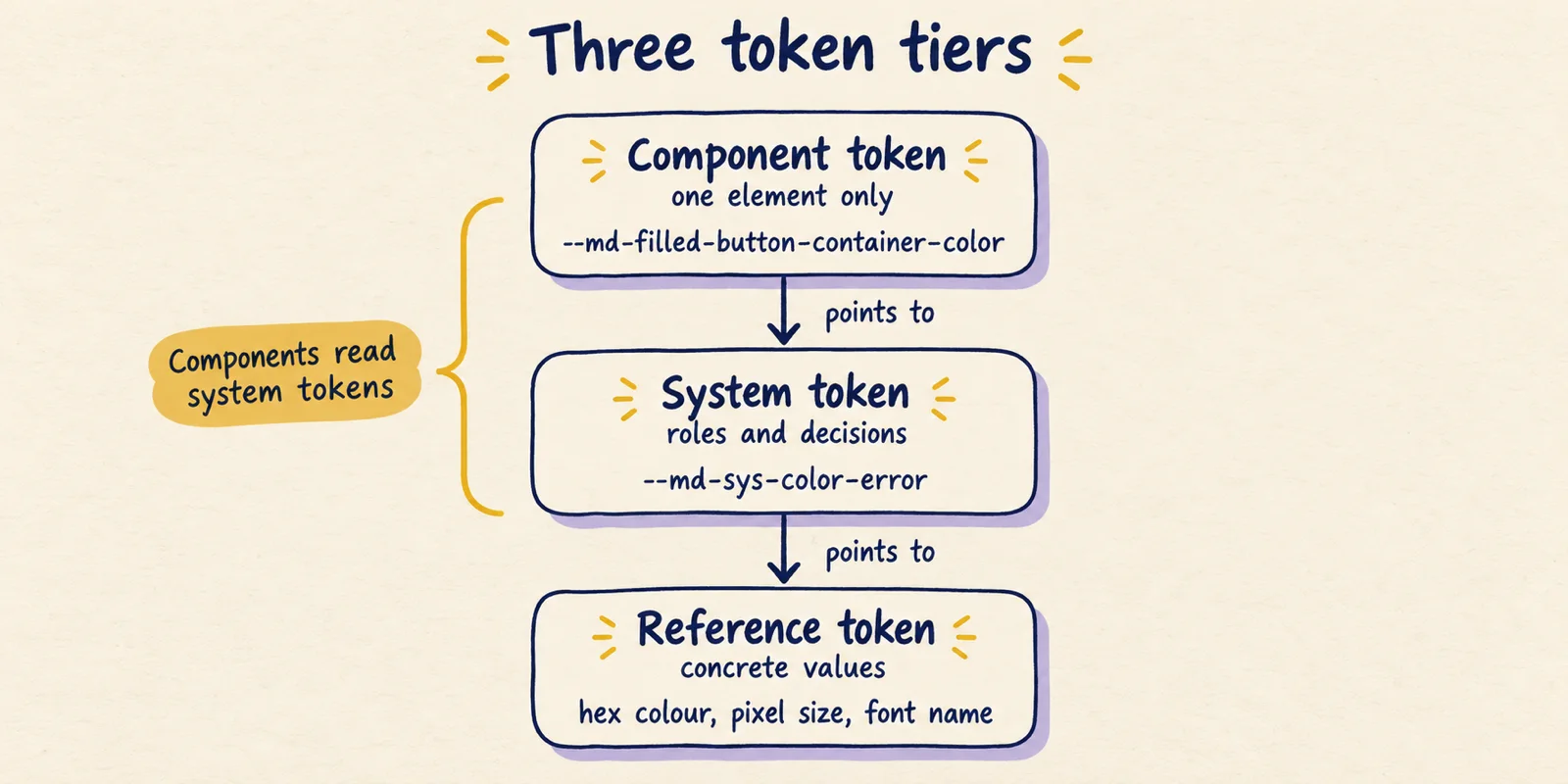
Material documents three tiers. In the Material Web docs, reference tokens "hold concrete values, such as a hex color, pixel size, or font family name"; system tokens define decisions and roles; component tokens are attributes assigned to elements and "can be system tokens or concrete values" (documented). The docs also state the direction of the arrows: each component token maps to a system token, which has a concrete reference value. Their own example overrides a component token with a system one: --md-filled-button-container-color: var(--md-sys-color-error).
Primer, GitHub's design system, uses the same idea with different names. Its token naming guide describes base tokens that map to raw values (for example base-size-4), functional tokens for global UI decisions (bgColor-inset, borderColor-default) and component or pattern tokens scoped to component CSS (button-primary-bgColor-hover) (documented). The naming differs from Material's; the structure matches. A reader comparing systems should draw the tiers, not the names.
The structure matters because of what it forbids. Brad Frost's design systems Q&A recommends "a three-tiered token system for creating themeable design systems" and reserving component-specific tokens for narrow cases, because they multiply quickly (documented). A good token map therefore draws arrows in one direction only and labels what each tier is allowed to point at. Brad Frost has also described tokens as "subatomic particles" that a UI design system needs but that do nothing on their own:
"What's the relationship between design tokens and atomic design?" is a question I hear a lot. Design tokens are "subatomic particles" which are critical to a UI design system but not functional on their own.
— Brad Frost (@brad_frost) View on X
One practical point for anyone storing tokens in files. The Design Tokens Community Group published the first stable version of its format specification, 2025.10, on October 28, 2025, describing it as a vendor-neutral format for sharing design decisions across tools. It is a Community Group report, not a W3C Standard (documented). A token map should say which format the tiers live in, since the format decides how aliases between tiers are written. The related question of how AI agents handle token formats is covered in Markdown or JSON for design tokens.
Map 2: component anatomy, naming the parts
Component anatomy is the list of a component's named parts. An anatomy map labels a picture of the component with those names and marks which parts are optional or vary between variants. Its job is vocabulary: when a designer says "container", an engineer writes container, and a technical writer documents it, they are all talking about the same thing.
Carbon's button usage page is a clean example. It labels three parts: Label, Container and Icon (optional), and shows them across four button types. The ghost button has no visible container, and the icon-only button has no label (documented, Carbon button usage page). That variation is the valuable part. An anatomy map that shows only the fullest version hides the cases where a part is absent, and those are the cases that cause review arguments.
Part names are most useful when they match names elsewhere in the system. Material Web's component tokens for its filled button are named after parts, for example container-shape, container-color and label-text-color (documented, from the token example in its theming guide). Whether Material's anatomy page uses the same words could not be checked, because the page renders client-side and its text could not be retrieved. As an inference, the best anatomy maps share their vocabulary with the token names and the component's API, so a part that appears in the drawing can be found in the code.
Component documentation can also act as an anatomy checklist. The GOV.UK Design System's button page, for instance, is organised as when to use, how it works, variants (each with an example, HTML, a Nunjucks macro and an options table), double-click prevention, research findings and recent changes (documented). That is a template for what every component page should answer, which is a different thing from a diagram but pairs well with one.
Map 3: package dependencies, what depends on what
A package dependency map is the one diagram that can be generated almost mechanically, and it is also easy to let go stale when drawn by hand. A design system ships as several packages: tokens, styles, icons, framework components. Engineers need to know which depend on which, so they can reason about upgrades and about where a bug can come from.
Carbon is a useful case because its monorepo README lists twelve packages with one-line descriptions, and each package's package.json declares its dependencies (documented, checked October 1, 2026 against the main branch). The declared chain runs from @carbon/react to @carbon/styles, then to @carbon/themes, @carbon/type, @carbon/grid and finally @carbon/layout. Side branches reach @carbon/icons-react from react, @carbon/motion from styles, and @carbon/colors from themes. The drawing below shows only that backbone and says so.
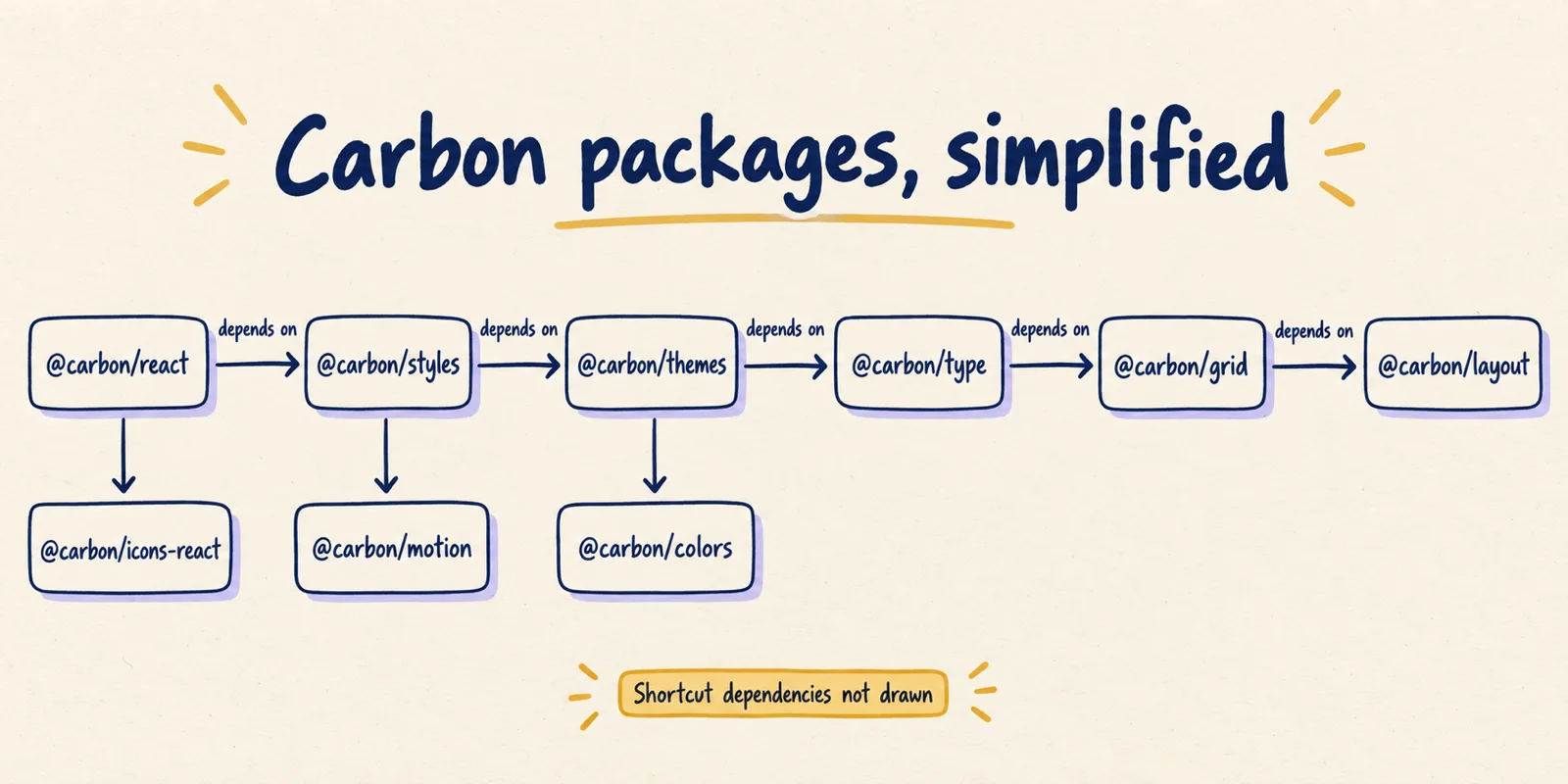
Reading the full dependency list gives answers the simplified picture cannot. As of October 1, 2026, @carbon/react (version 1.117.0) declares @carbon/feature-flags, @carbon/icons-react, @carbon/layout, @carbon/motion, @carbon/styles and @carbon/utilities. @carbon/layout (11.60.0) declares no Carbon dependencies. From those declarations, a change in @carbon/layout can reach react, styles, themes, type, grid and elements, while @carbon/colors, @carbon/motion and @carbon/icons-react sit outside its path (inference from declared dependencies; version ranges and lockfiles can narrow what a given product actually receives).
Primer's smaller graph shows the same idea. @primer/react (38.40.0) declares @primer/behaviors, @primer/live-region-element, @primer/octicons-react and @primer/primitives, and @primer/primitives (11.10.0), the home of the tokens from Map 1, declares no Primer dependencies (documented). So the token package sits at the bottom of Primer's stack, the same position the token tiers occupy conceptually.
Two cautions. These versions move constantly, so a package map needs a date. And an ecosystem poster is not a substitute: Brad Frost's own version includes repositories, Storybooks and design libraries, and he notes that organisations start seeing value after implementing only a fraction of it. If the question is what depends on what, draw only dependencies.
Map 4: contribution and release, who decides and how it ships
A contribution and release map follows a change from an idea to a published version. Its reader is a person who wants to propose something, or a product team wondering when a fix will arrive. Two public examples show how much detail this map can carry when the process is written down.
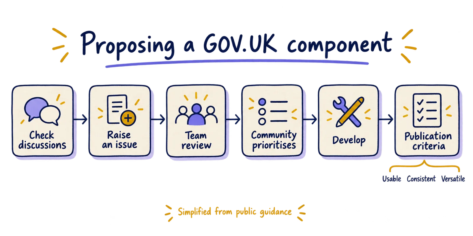
The GOV.UK Design System documents how to propose a component or pattern: check the existing GitHub discussions, raise an issue with evidence of user need (not designs or code), ask the Design System team to review it, then enter the yearly community prioritisation. Proposals must meet its contribution criteria. At proposal, the work must be useful, with evidence that many teams or services need it, and unique, meaning it does not replicate something already in the system. At publication it must be usable (tested with representative users, including disabled people), consistent and versatile (documented).
Release is a separate flow, and a map should keep it separate. GOV.UK Frontend's release runbook in its repository has a maintainer run a build-release workflow, a second developer review the resulting pull request, then run a publish-to-npm workflow that a second developer approves, then a GitHub release workflow. It requires developers to pair on releases, and a follow-up page covers updating the documentation repos, emailing subscribers and posting to Slack channels (documented). Primer React shows a lighter version: contributors add a changeset to a pull request, a maintainer reviews it, minor and patch changes are released weekly, and breaking changes are bundled into a major release twice a year (documented in its contributor docs; cadence may have changed).
Brad Frost's governance diagram covers the same ground from the product team's side, with ten steps from product teams using the system to adoption and QA, and an October 2024 update that sorts incoming issues into bugs, design discrepancies, system features and recipes. He walks through it in a talk published by Big Medium:
He also argues that the diagram is not the point. In a July 2024 post he writes that "when in doubt, have a conversation", noting that a large part of governance happens as a quick chat. A workflow map should therefore show where a person can ask, not only the formal path.
Where atomic design fits among the four
Atomic design is the diagram most people have seen, and the one the keyword "atomic design system" points to. It has five stages: atoms (elements that cannot be broken down further), molecules (simple groups of atoms), organisms (relatively complex sections of an interface), templates (components placed in a layout) and pages (templates with real content). Frost presents it as a mental model:
think of the stages of atomic design as a mental model that allows us to concurrently create final UIs and their underlying design systems.
Atomic design is a composition map: it answers how small parts build into larger ones. That is a real question, and a useful one for component libraries. In this article's four-way split it is a classification of components by size, and none of the four questions above is about size. It does not say what changes when a colour changes, what the parts of a button are called, which package contains what, or how a proposal becomes a release. As an inference, a team that draws only the atomic diagram has an accurate picture that cannot answer most of the questions its users ask.
A practical consequence follows for "design system components" documentation: an atoms-molecules-organisms listing is a reasonable index, but it needs the anatomy and token facts attached to each component to be useful.
How to draw one of these maps from evidence
The same six steps work for any of the four maps. The example in the last step uses the Carbon facts above.
- Write the question as one sentence and name the reader. If two readers need different answers, draw two maps.
- Pick the evidence that answers it: token docs, an anatomy page, package.json files, contribution criteria, a release runbook. If the only source is someone's memory, say so on the drawing.
- Use the system's own words for every node and arrow. Do not rename "functional tokens" as "semantic tokens" because you prefer the term.
- Give every arrow one meaning (points to, depends on, then) and keep it the same throughout the map.
- Mark what you left out, as in "shortcut dependencies not drawn", and put the date and source in the caption.
- Test it on someone who has not seen it: ask them the question from step one and see if they get the right answer from the drawing alone. Example: ask a new engineer what a change in the layout package can affect. If they cannot answer, the map is missing a dependency or the arrows are ambiguous.
Any drawing tool will do. If you want an editable hand-drawn style, Diagram Studio, the editor behind this site, can be used to draw these maps as editable diagrams, and the figures in this article were generated in a hand-drawn style with an image tool and checked against the sources, not made in it. (Disclosure: this article is published by the Diagram Studio team.)
For a side-by-side view of how ten systems structure their tokens, packages and theming, see How 10 public design systems are built.
Common mistakes, by map
| Map | Common mistake | Repair |
|---|---|---|
| Token flow | Components point straight at reference values, or arrows run both ways | One direction only; label what each tier may point at |
| Token flow | Showing every token instead of the tiers | Draw tiers with one or two example names each |
| Anatomy | Only the fullest variant is drawn | Show variants where a part is absent, as Carbon does for ghost and icon-only buttons |
| Anatomy | Part names differ from API and token names | Reuse the names from code, then check them |
| Package dependencies | Drawn from memory or from an aspirational stack | Generate from declared dependencies and date the result |
| Package dependencies | An ecosystem poster used to answer an upgrade question | Draw dependencies only |
| Contribution and release | Contribution and release merged into one flow | Two maps, since different people run each stage |
| Contribution and release | No place to ask a person | Mark the conversation channel on the map |
Draw the question first, the system second
A design system diagram earns its place when a reader can ask it a question and get a checked answer. Of the four maps, the package dependency map is the cheapest to make accurate, since the facts are in the repository. The token flow map records which direction references may travel, which is the rule theming depends on. The anatomy map settles arguments over names. The contribution and release map is the one a person outside the team needs in order to propose a change.
Start with whichever question your team gets asked most often, draw only that map from the public or internal source, and put the date on it. The documented behaviour in this article is as of October 1, 2026; versions, release cadences and process pages change, so check the linked sources before copying a figure.