Design systems
How 10 Public Design Systems Are Built: Token Layers, Packages and Theming, Compared From Their Repositories
We read ten public design-system repositories instead of their landing pages. Token formats, package layouts and theming mechanisms differ more than the marketing suggests.
· Diagram Studio Editorial
Direct answer
In ten public design-system repositories snapshotted on October 1, 2026, no two share a token pipeline. Token values are written as JSON (2 systems), TypeScript (5), CSS or Sass (2), or kept in a separate repository (1). Repository shape runs from one package to 249 workspace packages, and component counts depend so much on the counting rule that one "number of components" does not compare.
What ten repositories show about design-system architecture
No two of the ten repositories we examined build design tokens the same way. Token values are written as JSON or JSON5 in two of them, as TypeScript in five, as CSS or Sass in two, and kept in a separate repository in one. Repository shape runs from a single package to 249 workspace packages. And the question "how many components does it have?" gives different answers inside the same repository: Carbon's React package yields 147 component folders and its web-components package yields 100.
A design token is a named design value, such as a colour, a spacing step or a duration, stored in one place so that design tools and code read the same source. The Design Tokens Community Group published its first stable format specification, version 2025.10, in October 2025. Two of the ten systems write tokens in that format's key style. The other eight do not.
This article reports what we found in each repository's files on one day. It is not a ranking. These projects solve different problems: a copy-and-own registry, a web-components library, an internal product system and a full enterprise kit are not competing for the same job. Where a statement is read straight from a file or official page we label it documented. Where we interpret what the files imply we label it inference.
How the snapshot was taken
We picked ten design systems that publish their source in public repositories and that cover the main approaches: IBM Carbon, GitHub Primer, Material Web, Adobe React Spectrum, Fluent UI, Chakra UI, Mantine, Radix Themes, shadcn/ui and Ant Design. Shopify Polaris was the obvious eleventh name. Its React repository is now archived, so we measured it under the same rules but treat it as a reference row, not one of the ten.
On October 1, 2026 we made a shallow clone (depth 1) of each default branch, recorded the commit SHA, and ran three small scripts: one that resolves each repository's workspace globs and counts packages, one that probes for specific files and strings, and one that counts component folders under written rules. Primer is the only system whose components and tokens live in two repositories, so both are listed. The scripts and raw output are saved with the article's research files, and the rules below are enough to reproduce them.
| System | Repository at commit | Last commit | License file | Note |
|---|---|---|---|---|
| Carbon | carbon-design-system/carbon @ c73d227 | 2026-10-01 | Apache-2.0 | Active |
| Primer (components) | primer/react @ c4189aa | 2026-09-30 | MIT | Tokens are in primer/primitives |
| Primer (tokens) | primer/primitives @ f48bc06 | 2026-09-09 | MIT | Token source and build |
| Material Web | material-components/material-web @ a6b2d26 | 2026-09-30 | Apache-2.0 | README says maintenance mode |
| React Spectrum | adobe/react-spectrum @ 57c56b8 | 2026-09-30 | Apache-2.0 | Includes Spectrum 2 package |
| Fluent UI | microsoft/fluentui @ 6116761 | 2026-10-01 | MIT | GitHub API reports no SPDX match; the file reads MIT |
| Chakra UI | chakra-ui/chakra-ui @ 9611614 | 2026-09-24 | MIT | Active |
| Mantine | mantinedev/mantine @ f38933c | 2026-09-26 | MIT | Active |
| Radix Themes | radix-ui/themes @ 1faff10 | 2026-04-11 | MIT | Last commit about five and a half months old |
| shadcn/ui | shadcn-ui/ui @ b0fcb58 | 2026-09-30 | MIT | Copy-and-own registry |
| Ant Design | ant-design/ant-design @ 820e1a8 | 2026-10-01 | MIT | Single package |
| Polaris React (reference) | Shopify/polaris-react-archive @ 3f7954a | 2026-09-09 | MIT-style text | Archived, deprecated |
One technical caveat: the Primer React clone prints a warning on case-insensitive file systems because some Playwright screenshot files differ only by letter case. Those are image files, not source, and do not affect any count here.
Repository shape: from one package to 249
We counted a workspace package as any directory matched by the repository's workspace globs (from package.json or pnpm-workspace.yaml, negations honoured) that contains a package.json, plus the root manifest when it is named and not private. "Non-private" means the manifest has a name and is not marked private. That figure still includes internal tooling that is simply not marked private, such as Mantine's documentation packages, so read it as an upper bound on what is published.
| System | Workspace tooling at the root | Workspace packages (all / non-private) | Framework targets declared in this repo |
|---|---|---|---|
| Carbon | Yarn, Lerna, Nx | 38 / 28 | React, web components (Lit); also an icons-vue package |
| Primer components | npm, Turborepo | 13 / 4 | React; a styled-react compatibility package |
| Primer tokens | npm | 3 / 2 | None (tokens only) |
| Material Web | npm, one library plus a catalog site | 2 / 2 | Web components (Lit) |
| React Spectrum | Yarn, Lerna | 249 / 220 | React (205 packages declare it) |
| Fluent UI | Yarn, Nx | 259 / 131 | React (97 packages), web components (2 packages) |
| Chakra UI | pnpm | 20 / 6 | React; a Panda preset package |
| Mantine | Yarn | 32 / 30 | React; optional Emotion and vanilla-extract packages |
| Radix Themes | pnpm, Turborepo | 2 / 1 | React |
| shadcn/ui | pnpm, Turborepo | 5 / 3 | React registry components plus a CLI package |
| Ant Design | none (single package) | 1 / 1 | React |
The biggest numbers belong to systems that publish one package per component or per concern. Fluent's React v9 components live in 60 separate react-* packages under packages/react-components, and Spectrum splits state, accessibility hooks and styled components into separate package families. That is inference from the layout, but it explains why 259 and 249 say more about how the code is cut up than about the size of the product.
Framework reach is also uneven. Seven of the ten repositories ship React only. Carbon, Fluent and Material Web include web components in the same repository. Other framework ports can exist in other repositories, which this study did not search.
Where token values are written
Token values sit in four kinds of place. The table lists the location, the format and one count per system as evidence that the files exist and are not stubs. The counts are file counts or text matches, so do not compare them across rows: a JSON5 $value and a TypeScript var(--x) line are not the same unit.
| System | Where token values are written | Format | Evidence in the repo |
|---|---|---|---|
| Primer | primer/primitives, src/tokens | JSON5 with $value and $type keys, compiled with Style Dictionary | 61 JSON5 files, 3,453 $value matches; Style Dictionary 5 as dev dependency |
| Carbon | packages/themes/src/dtcg | JSON in the Design Tokens Community Group format; older TypeScript definitions remain | 6 JSON files with 312 $type nodes; 12 TypeScript token files still present |
| Fluent UI | packages/tokens/src (global, alias, themes) | TypeScript | 11 + 8 + 8 files; 467 tokens mapped to var(--…) names |
| Chakra UI | packages/react/src/theme/tokens and semantic-tokens | TypeScript | 18 token files, 3 semantic-token files; 107 _light value pairs in semantic colors |
| Mantine | MantineProvider/default-theme.ts and default-css-variables.css | TypeScript theme object plus a CSS file | 99 CSS Modules in @mantine/core |
| Ant Design | components/theme (seeds, maps, alias, algorithms) | TypeScript | 5 map files; 3 algorithm folders (default, dark, compact) |
| shadcn/ui | apps/v4/registry/themes.ts | TypeScript objects holding cssVars for light and dark | 24 registry:theme entries; 809 oklch() values |
| Radix Themes | src/styles/tokens | Hand-written CSS custom properties | 10 token CSS files plus 31 colour-scale files |
| Material Web | tokens/ | Sass | 2 reference, 6 system and 49 component token files |
| React Spectrum | Not in this repo: @adobe/spectrum-tokens 14.15.0 | JSON, imported by the Spectrum 2 package | One dependency; source in adobe/spectrum-design-data |
Three details matter more than the counts. First, Carbon's README says all themes and component tokens "have been migrated" to the Community Group format, yet the older TypeScript token files are still in the tree, so the repository is mid-transition. Second, Primer keeps tokens and components in different repositories, and the React package lists @primer/primitives as a dependency (10.x or 11.x). Third, Radix Themes has colour-scale CSS in the repo but also depends on @radix-ui/colors, so the scales are partly sourced elsewhere.
The Design Tokens Community Group today announced the first stable version of the Design Tokens Specification (2025.10)
Spectrum is the clearest case of tokens living outside the component repository. Its Spectrum 2 package takes @adobe/spectrum-tokens as a development dependency and reads the values into a styling function. Adobe's styling documentation says the style macro runs at build time and returns a class name that applies Spectrum 2 design tokens, so the token JSON is consumed when the app is built, not shipped to the browser as a theme object.
A couple years ago I designed the styling system for React Spectrum. It's inspired by StyleX and Vanilla Extract's Sprinkles, and built on bundler macros.
— Devon Govett (@devongovett) View on X
How many token layers, and who names them
A token layer is a step of indirection: a raw value, then a meaning that points at it, then optionally a component-specific name that points at the meaning. Four systems expose the layers in their file names or documentation, and they use four different vocabularies.
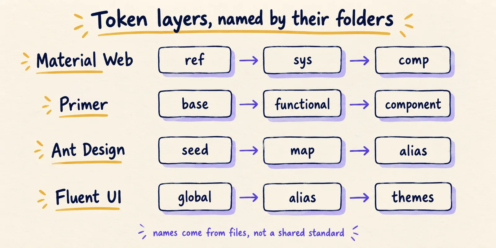
Material Web's tokens/ folder holds 2 reference files, 6 system files and 49 component files, named _md-ref-*, _md-sys-* and _md-comp-*. Primer's token source splits into base (12 files), functional (22) and component (27), and Primer's own token documentation describes base tokens as the lowest level, mapping directly to a raw value. Ant Design's theme documentation names seed, map and alias tokens and describes a three-layer derivation. Fluent's @fluentui/tokens package has global, alias and themes folders with 11, 8 and 8 files.
Carbon and Chakra do not use the same triple. Carbon's DTCG folder separates theme tokens (one file covering four themes) from component tokens (button, tag, notification, status and content switcher). Chakra separates base tokens, semantic tokens (colours, radii and shadows) and recipes, which are the component style definitions. Both are our reading of the folder structure, so treat them as inference.
The practical conclusion is modest. Three tiers is a common pattern, not a rule, and the names do not map one to one. Ant's documentation defines alias tokens as controls for common components in batches, while Fluent's alias folder holds the colour tokens that give palette values a meaning (our reading). What does match across systems is the middle tier, the one that gives a value a meaning such as "surface" or "danger". That is where light and dark modes, high-contrast themes and brand overrides attach.
How a theme reaches the screen
Reading the code paths, the ten systems deliver themes in three ways. Which one a system uses decides whether you can change a theme at runtime, whether a provider component is required, and where theme values can be wrong.
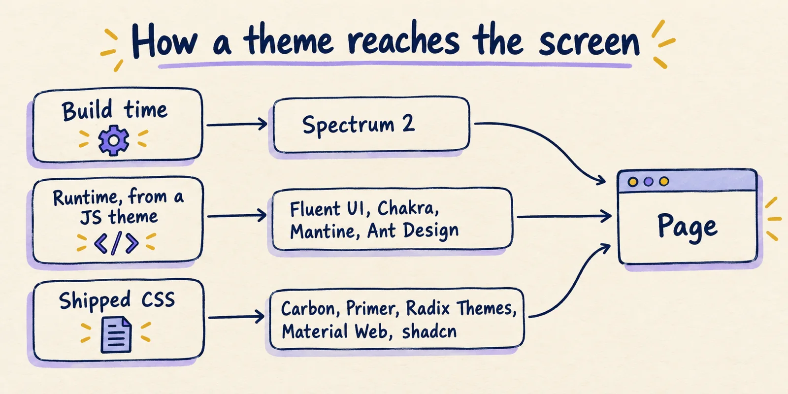
**Shipped CSS.** The theme is a set of CSS custom properties in a stylesheet, switched by a class or attribute. Radix Themes writes .dark and .dark-theme selectors in all 31 of its colour files. Primer's React package reads data-color-mode attributes in 5 files, and its token build defines 14 theme variants. Material Web's components reference --md-sys-color-* properties in 26 Sass files, and its theming guide shows overriding them in plain CSS. shadcn/ui's theming guide describes CSS variables for semantic tokens such as background and primary, which Tailwind turns into utilities. Carbon's themes package builds Sass that emits custom properties, and its README lists four themes: white, g10, g90 and g100. Placing Carbon, Primer and Material Web in this lane is inference from their Sass, token-build and component styles; we did not trace every code path.
**Runtime from a JavaScript theme.** A provider component turns a theme object into CSS variables when the app runs. Fluent's FluentProvider renders a <style> element and builds rules such as --colorNeutralForeground1: value. Mantine's provider injects a <style> element and sets data-mantine-color-scheme, which appears 16 times across 9 files in @mantine/core. Chakra's provider mounts an Emotion <Global> with the system's styles and switches on a .dark class, with 107 _light and _dark value pairs in its semantic colours. Ant Design registers styles at runtime through useStyleRegister from its CSS-in-JS package, and offers an optional cssVar mode on its configuration provider.
**Build time.** Spectrum 2 is the only one of the ten that resolves tokens into atomic CSS during the build, through its style macro, with light-dark() expressions in its theme file. That is a documented design choice, and the trade-off follows from it: no theme object to inject at runtime, but arbitrary themes are harder to supply from application code. The last part is our inference.
Runtime generation makes the theme ordinary data, which is convenient for per-tenant branding. Shipped CSS needs no provider and works with a plain stylesheet, but a new theme means new CSS. Neither is better in the abstract. They fit different products.
Component counts, and why they do not compare
Component counts are the number readers want and the one that is hardest to make fair. We used one rule per source directory, applied the same way everywhere: for PascalCase layouts, count immediate subdirectories whose name starts with a capital letter. For kebab-case layouts, count immediate subdirectories (or .tsx files, where a component is a single file) whose names are not on a short deny list of helper folders such as utils, internal, hooks and theme. Material Web is counted as unique @customElement('md-…') tag names across all of its .ts files, including labs and internal helper elements, because its folders group several elements. Fluent React counts react-* packages that contain a src/components folder.
| System | Source counted | Rule | Units |
|---|---|---|---|
| Carbon | @carbon/react components | PascalCase folders | 147 |
| Carbon | @carbon/web-components components | kebab-case folders | 100 |
| Primer | @primer/react source | PascalCase folders | 74 |
| Material Web | @material/web | unique md-* element tags | 62 |
| React Spectrum | @react-spectrum/s2 source | PascalCase .tsx files | 89 |
| React Spectrum | React Aria Components source | PascalCase .tsx files | 65 |
| Fluent UI | React v9 component packages | react-* with src/components | 60 |
| Fluent UI | Web components v3 | folders with a same-named .ts | 42 |
| Chakra UI | @chakra-ui/react components | kebab-case folders | 115 |
| Mantine | @mantine/core components | PascalCase folders | 116 |
| Radix Themes | @radix-ui/themes components | .tsx files, minus .props | 59 |
| shadcn/ui | Registry, Radix base | .tsx files in ui | 61 |
| shadcn/ui | Registry, Base UI base | .tsx files in ui | 62 |
| Ant Design | antd components | kebab-case folders | 77 |
| Polaris React (archived) | @shopify/polaris components | PascalCase folders | 121 |
Four things in the table show why a single number misleads. The same system gets two answers: Carbon's 147 against 100, Fluent's 60 against 42. Counts include parts that are not components in a catalogue sense: 6 of Carbon's 147 folders end in "Item", and Chakra's 115 include layout primitives such as box, flex and stack. Material Web counts md-filled-button and md-outlined-button as two elements. And shadcn/ui ships parallel registries: the Radix and Base UI versions differ by one file, toast.tsx, which exists only in the Base UI set.
If you need a comparable figure for your own shortlist, write the rule down first, count under it, and publish the rule beside the number. A count without its rule is an opinion.
Status and distribution change what you are adopting
Structure is only half of the picture. Two systems here carry status notices that matter more than any count.
MWC is in maintenance mode pending new maintainers
The notice sits in the README of a repository that had a commit on September 30, 2026. Maintenance mode is the maintainers' own description of the project's state. We did not assess what it means for any release plan.
The Shopify Polaris React library is deprecated. We are no longer accepting contributions or feature requests in this repository.
The same README says Polaris Web Components were released on October 1, 2025 for Shopify app development. A repository search for "Polaris design system" can therefore return a deprecated React library, which is why it is a reference row here and not one of the ten.
Distribution model is the other hidden variable. Most systems here are packages you install and upgrade. shadcn/ui is not:
This is not a component library. It is how you build your component library.
In practice that means the components in its registry are copied into your project and become your code, with the theme as CSS variables in your stylesheet. That changes upgrade work, ownership and review, and no package or component count captures it.
Radix Themes shows a third status pattern: its last commit was April 11, 2026, much older than the rest of the sample. A quiet repository is not by itself evidence of abandonment, and we did not examine its issues or releases. It does mean you should check both before relying on it for new features.
Conclusion: read the repository, not the component count
Ten public design systems answer the same question, how do we keep an interface consistent, with ten different pipelines. The differences that affect a team are not in the headline numbers. They are where token values are written, how a theme reaches the page, who owns the code after you adopt it, and whether the project is still moving.
The same five checks work on any system you are considering, public or internal.
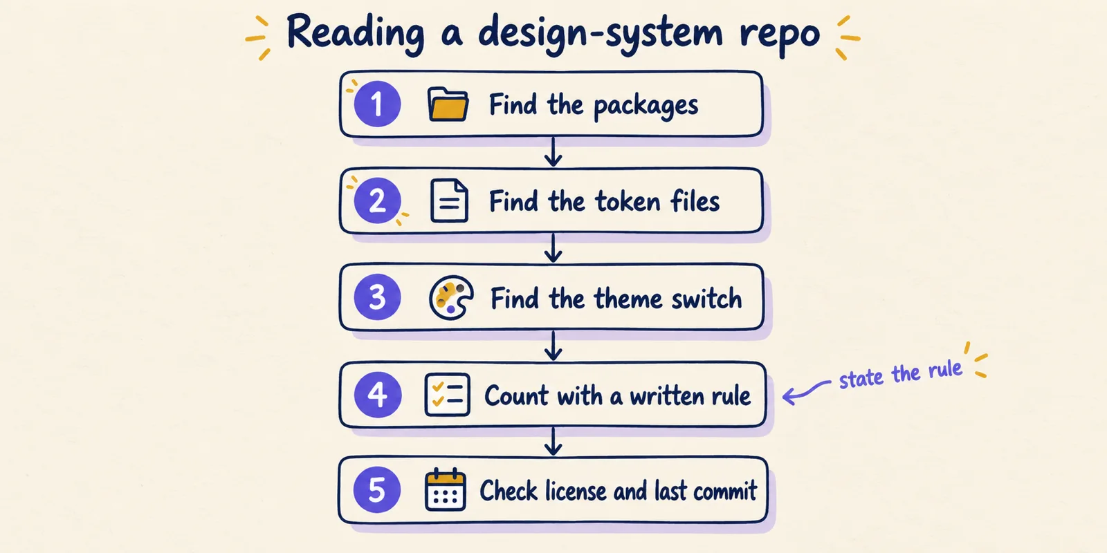
- Find the packages. Read the root
package.jsonworkspaces orpnpm-workspace.yaml, list directories with apackage.json, and note which are markedprivate. - Find the token files. Search for
$value,--custom property declarations or atokensfolder, and note the file format and whether the source is in this repository or a dependency. - Find the theme switch. Search for
data-attributes and.darkselectors in CSS, and for provider components that render a<style>element or call a CSS-in-JS registration function. - Count with a written rule. Pick one source directory per package, define what a unit is, and keep the rule next to the number.
- Check the license and last commit. Read the license file, run
git log -1 --format=%cI, and look for archive or maintenance notices in the README.
Everything here is as of October 1, 2026. Repositories change daily, so a re-run of the same rules will give different numbers. The rules are meant to survive that.